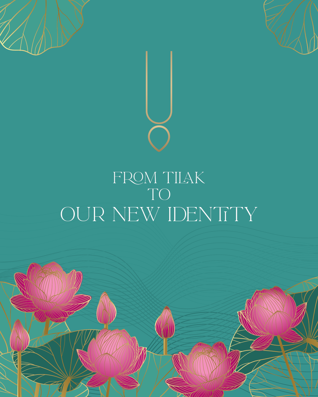
At KAQI Entertainment, we believe that every brand is more than just its name or visuals — it’s about the story it tells and the energy it carries. Our recent rebranding project for KAQI Talents’ devotional music label, Sanātana Sankirtan, was born from this very thought.
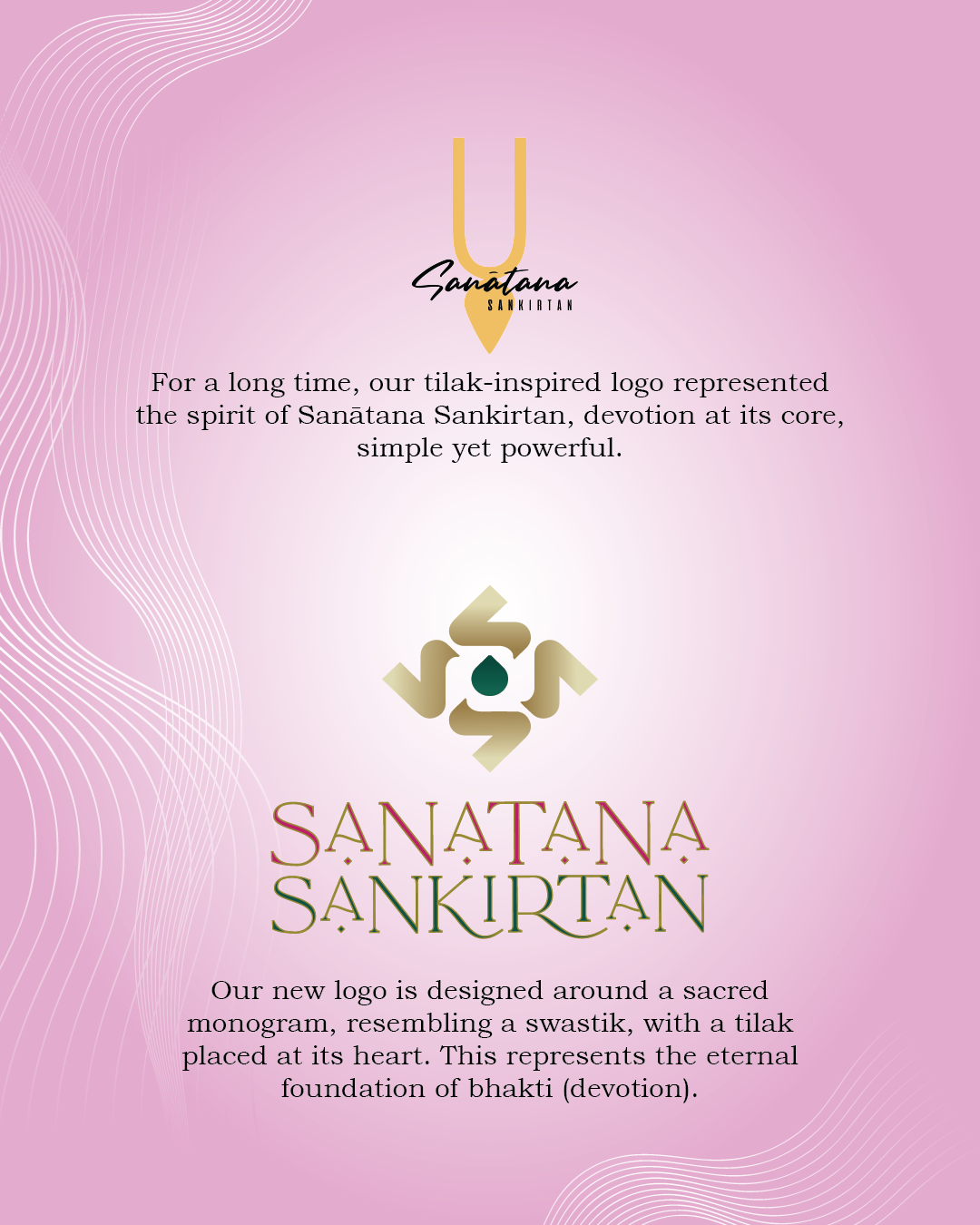
For a long time, Sanātana Sankirtan’s tilak-inspired logo symbolized simplicity and devotion. It was a strong foundation, but as the label grew in reach and vision, we felt the need to create an identity that reflects both its spiritual roots and its expanding impact.
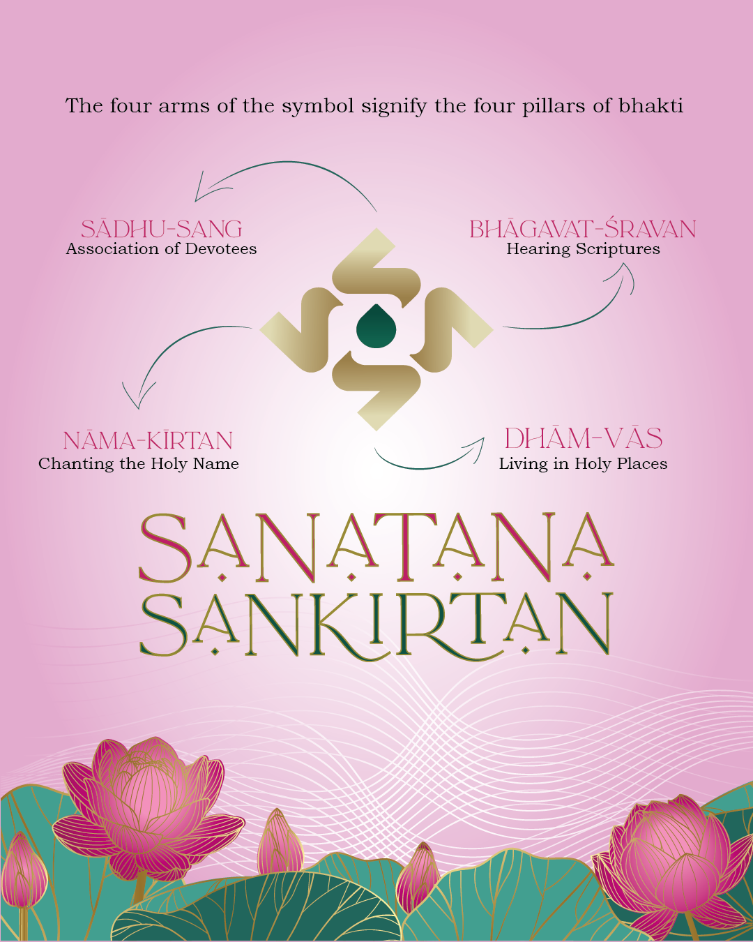
The new identity is designed around a sacred monogram resembling a swastik, with a tilak at its heart. Each element holds deep significance:
🌿 Four Arms of the Symbol – Represent the four eternal pillars of bhakti:
1️⃣ Sādhu-Saṅg – Association of devotees
2️⃣ Nāma-Kīrtan – Chanting the holy name
3️⃣ Bhāgavat-Śravaṇ – Hearing the scriptures
4️⃣ Dhām-Vās – Residing in the holy places
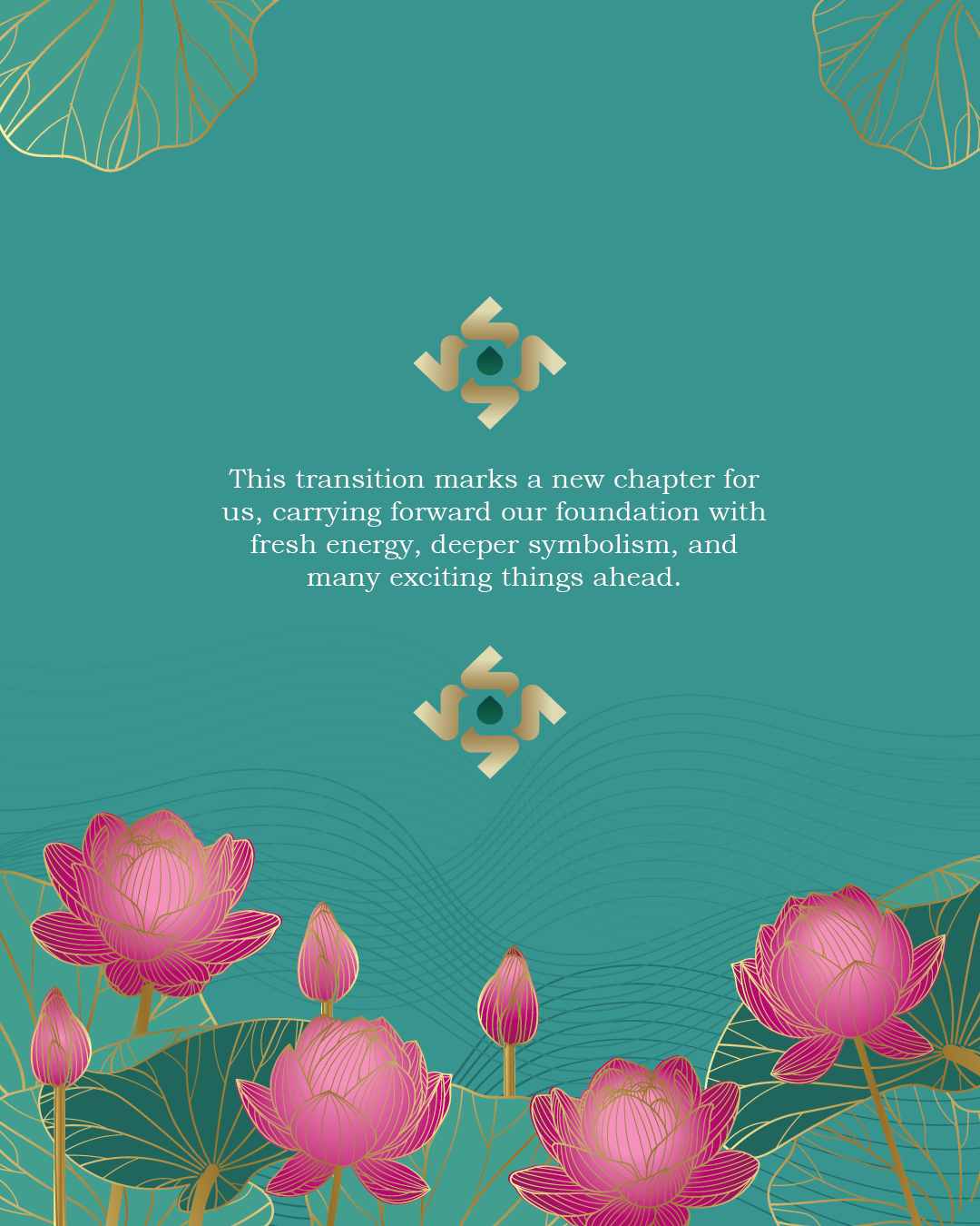
✨ Tilak at the Center – A reminder that all paths of bhakti lead us back to the divine source — the heart of Sanātana Sankirtan’s music.
This new identity reflects continuity and growth: rooted in tradition, yet ready for the future.
For KAQI Entertainment, this project is more than just a rebrand — it’s a step towards creating a timeless identity for one of India’s most heartfelt devotional music labels. We’re excited to see Sanātana Sankirtan continue spreading the message of bhakti with renewed energy, devotion, and a fresh visual identity.
Here it is — the new logo of Sanātana Sankirtan. 🚩🌸
Add Comment :